
Hot diggity dang! This is gonna be a juice one! First of all, we have to talk about Joe Kubert. According to Google
“Joseph Kubert was a Polish-born American comic book artist, art teacher, and founder of The Kubert School. He is best known for his work on the DC Comics characters Sgt. Rock and Hawkman.”
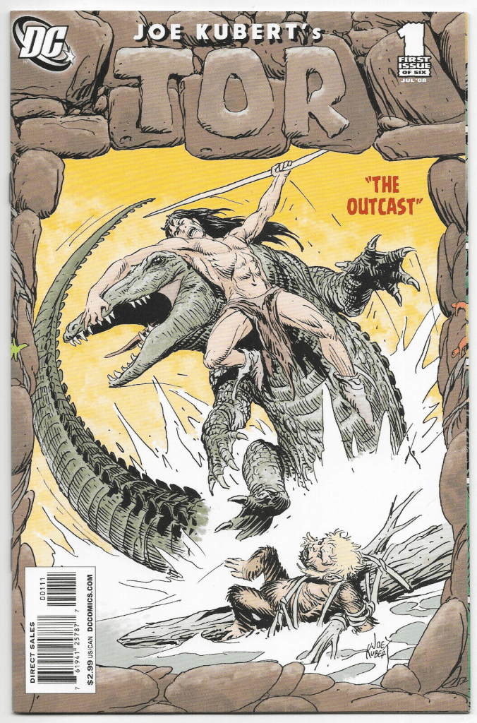
I had never before heard of this man but after reading this book I am tempted to get some of his art books because if there’s anything that stands out in this DC-published book is beautiful art. From the cover art to each individual page, this book is packed with 22 pages of prehistoric awesomeness, and each page is literally better than the last. From the noble panel layouts to the exciting action shots this book is a must-grab. The writing by Joe Kubert is also stellar, Tor is told mainly using narration boxes and a couple of thought balloon texts, which makes sense considering that we’re following a caveman through prehistoric times and there is minimal actual language during those times from what we know. Based on the ultra-expressive portrait shots and the exhilarating action panels, I’m sure this whole story could be read just as easily without a single piece of dialogue. Not to shoot Joe’s writing down at all, since each line of narration serves to better tell the story and allows us to emphasize the savage yet highly capable Tor.
Speaking of Tor let’s talk bout the things that this reminds me of and perhaps it’s not so bad that it reminds us of them. First off all the name, of course, reminds us of the nordic god of thunder so adored by Marvel fans, yet that’s where parallels end for our neanderthal champion and Marve’s thunderous hot boy. The next place my mind went to when grabbing this from the shelf, was Genndy Tartakovsky’s Primal. The style feels similar in some way and of course, the sort of story does as well, which makes me wonder if Genndy perhaps got inspired by Joe Kubert’s Tor, but that’s a topic for another day.
This story is a really great one and I’m excited to read even more of it, yet there is something that truly troubles me from this book, and sadly though not the fault of Joe it definitely hurts this book, and that is the ADS.
Listen I get it, we’re trying to make some money here but got dang DC! This book has too many ads. With a whopping 13 ads total and 5 full pages of front and back ads, one whole third of this book is filled with ads, which includes the back cover and the page behind the cover once you open the book. There are just too many ads, it’s like they tried to cram as many ads as humanly possible into this book, and I hate that. One-third of the book filled with ads is simply unacceptable. I would say maybe a max of 3-4 ads at most and they should all be at the end of the book, none of them being on the beautiful back cover which for some reason continues to elude the publishers. I get it that we’re just going to card them and store them and the back cover won’t be seen. Still, hey, we’re gonna have to take that book out at some point and show it to a friend or read it and that back cover should be as beautiful as the front cover page even if a little simpler, but that’s my opinion as a collector and an artist I guess. I would have much rather seen some concept art, some sketches or even a bit of the why behind Joe Kubert’s inspiration for this amazing story. It just felt like nonsense to have to thumb 5 full pages of ads to close the book, once the story is done I should be able to close the book and feel overjoyed at the amazing story I just read, not be left considering the horrible consequences of rampant capitalism, but I digress, this is not the stories fault and I’m sure Joe had no say when it came to putting all these ads in his book so let’s just go back to the story and what’s so great about it.
At first, when I opened the book I was left thinking this was a full solo piece by Joe but after finishing it we can see that even though most of the work is of Joe’s authorship there are some equally important figures that made this book a borderline masterpiece. We must mention the astute collaboration of Pete Carlsson on the colors and the valuable editing by Will Dennis, which no doubt helped make this book what it is; A tour de force in writing, storytelling, and illustrative fiction. The character designs are absolutely fantastic, from the strong-bodied Tor to the prehistoric reptilian monster creature, and the hairy ape-like beings. Each character in this book is simply fascinating to look at, and the colors are on a whole other level. They are simple with hardly any shading, yet feel almost like watercolors with their sporadic textures and harmonic nature. The action shots feel fast-paced yet detailed enough so your eye lingers just long enough to capture the action and admire the beautifully rendered figures. Black ink and minimum coloring give this book just the right sort of atmosphere, speaking of atmosphere! The landscapes are incredible as well, the forest, the lake, the rocks, everywhere you look you are transported into the very distant past to a story of hardship, survival, and ingenuity. Special mention to the dream sequence which felt almost like an LSD trip, which is so characteristic of many dreams often experienced by creative minds. I keep going back to the in-your-face fighting scenes, the way they are told with quick panel cuts and large sweeping illustrations feels more like a movie than a comic and that is everything in this medium that so often ends up turning into illustrated novels with huge blocks of texts. If anything I would have liked to see a bit more use of sound fxs and onomatopeias to drive the action a little further, but at the same time it’s not like it suffers because it doesn’t have it. The art is that good! This is one of those cases where good minimal writing is enhanced tenfold by superb, masterful, illustration skills.
This whole book is a huge favorite of mine and I am excited to pick up more installments in the series and hopefully collect this and all other series of it will keep an eye out for more of Joe Kubert’s masterful work which no doubt elevates any story it grazes.

I rate this book a: WOW! (4.5/5) for its beautiful art, amazing panel layouts, and superb action shots. The art is so good that I simply have to overlook the sickening amount of ads this book contains. (at least they’re mostly at the end and don’t interrupt the story otherwise a -.5 would not be my rating for them.)

Purchase other great comics like this by writing to Ton’O Comics on Instagram.
